There have been a litany of articles written recently discussing how the stock market is set for a continued bull rally. The are some primary points that are common threads among each of these articles which are: 1) interest rates are low, 2) corporate profitability is high, and; 3) the global cabal of Central Banks will continue to put a floor under stocks. While I do not disagree with any of those points -- it should be remembered that each is artificially influenced by outside factors. Interest rates are low because of Central Bank actions; corporate profitability is high due to share buybacks and accounting gimmickry,l and Central Bank interventions have artificially inflated asset prices.
However, while the promise of a continued bull market is very enticing it is important to remember that as investors we have only one job: "Buy Low/Sell High." It is a simple rule that is more often than not forgotten as "greed" replaces "logic." However, it is also that simple emotion of greed that tends to lead to devastating losses. Therefore, if your portfolio, and ultimately your retirement, is dependent upon the thesis of a continued bull market you should at least consider the following charts.
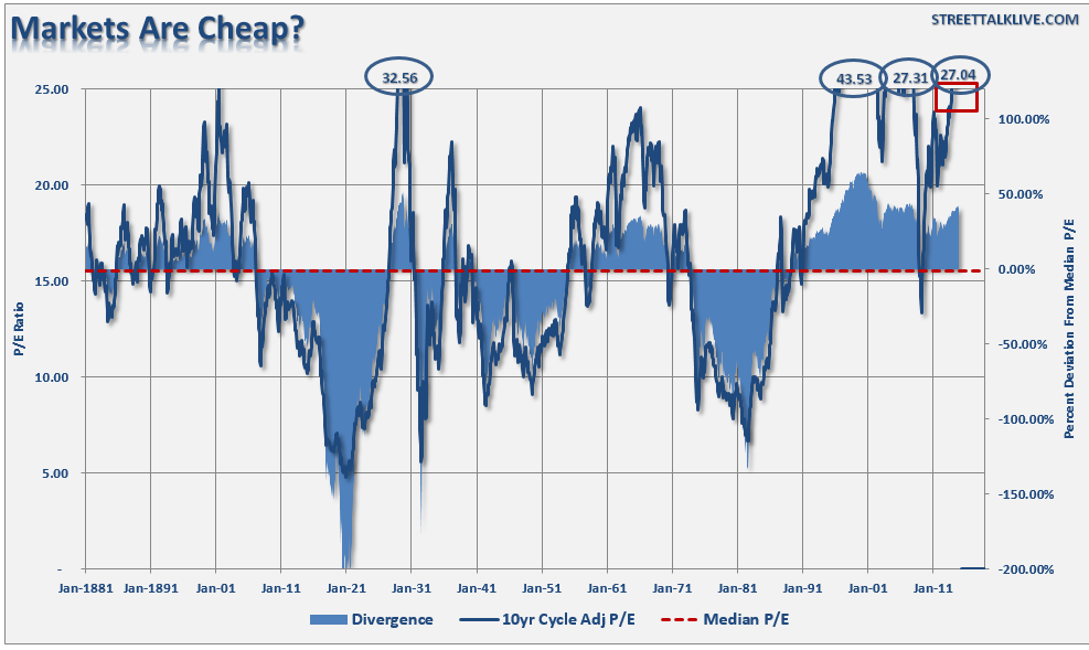
It is often stated that valuations are still cheap. The chart below shows Dr. Robert Shiller's cyclically adjusted P/E ratio. The problem is that current valuations only appear cheap when compared to the peak in 2000. In order to put valuations into perspective, I have capped P/E's at 25x trailing earnings which has been the level where secular bull markets have previously ended. I have noted the peak valuations in periods that have exceeded that level.
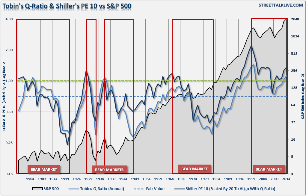
The next chart is Tobin's Q Ratio. James Tobin of Yale University, Nobel laureate in economics, hypothesized that the combined market value of all the companies on the stock market should be about equal to their replacement costs. The Q ratio is calculated as the market value of a company divided by the replacement value of the firm's assets. With the exception of the "tech bubble" we are near the peak of every major bull market in history.
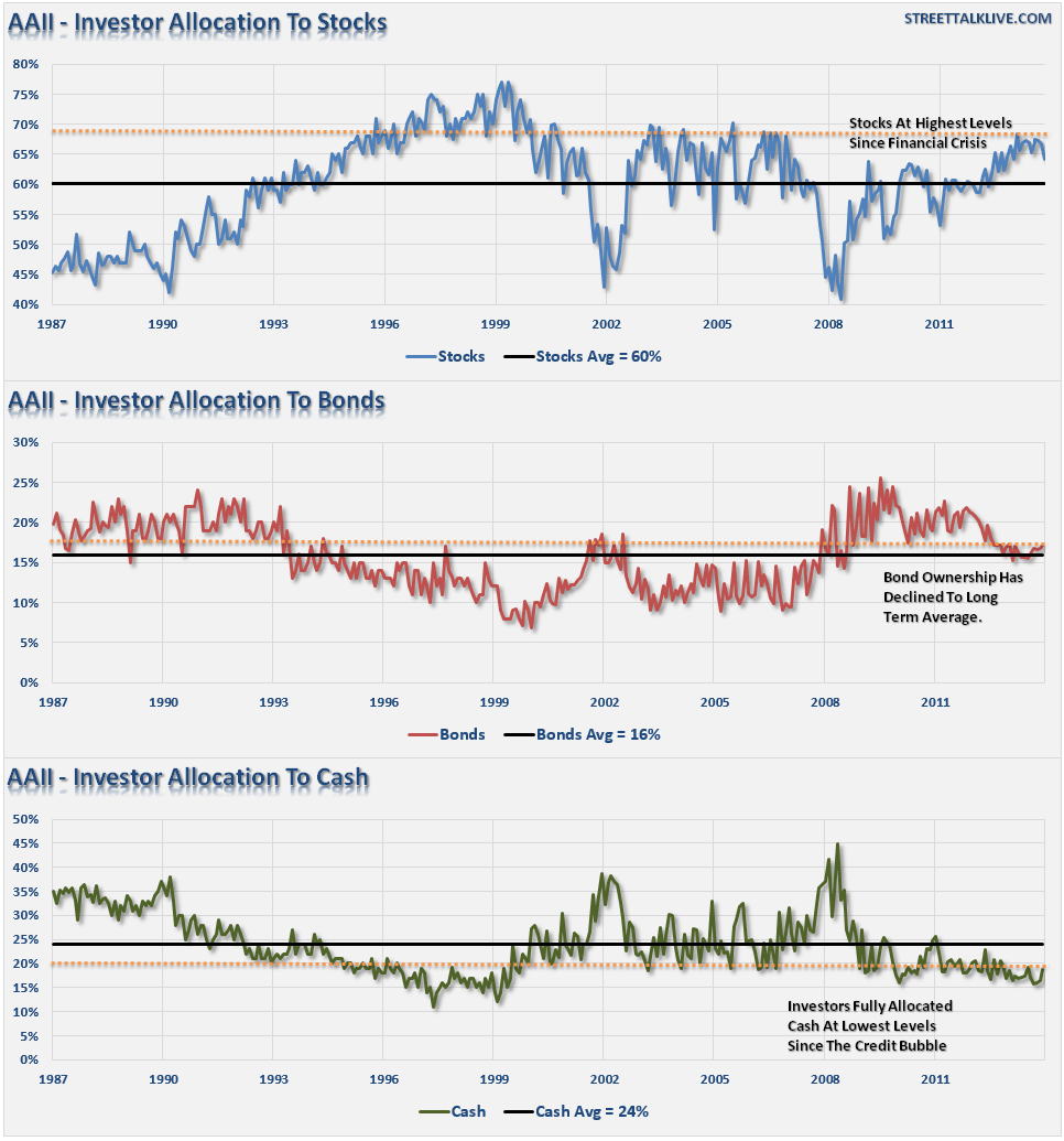
Another argument consistently made is that retail investors are just now beginning to jump into the market. The chart below shows the percentage of stocks, bonds and cash owned by individual investors according to the American Association of Individual Investor's survey. As you can see, equity ownership and near record low levels of cash suggest that the individual investor is "all in." Also, note that when these levels reverse it has been coincident with intermediate and major market corrections.
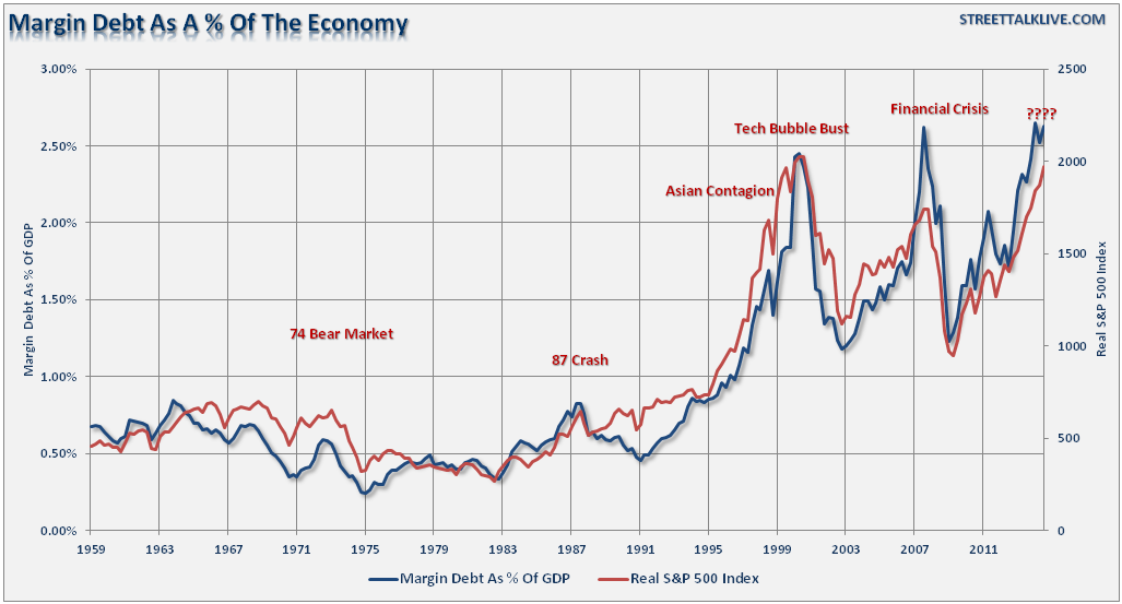
Of course, with investors fully committed to stocks it is not surprising to see margin debt as a percentage of the S&P 500 at record levels also. It is important to notice that sharp spikes in this ratio have always coincided with market corrections of which some have been much worse than others. The chart below shows inflation-adjusted margin debt as a percentage of the economy. Current levels are excessively optimistic.
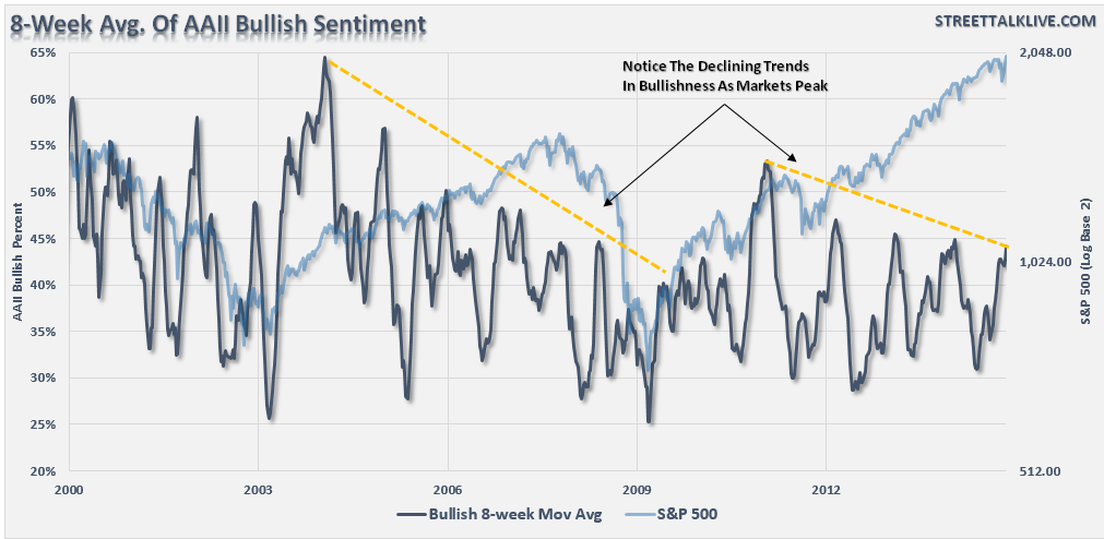
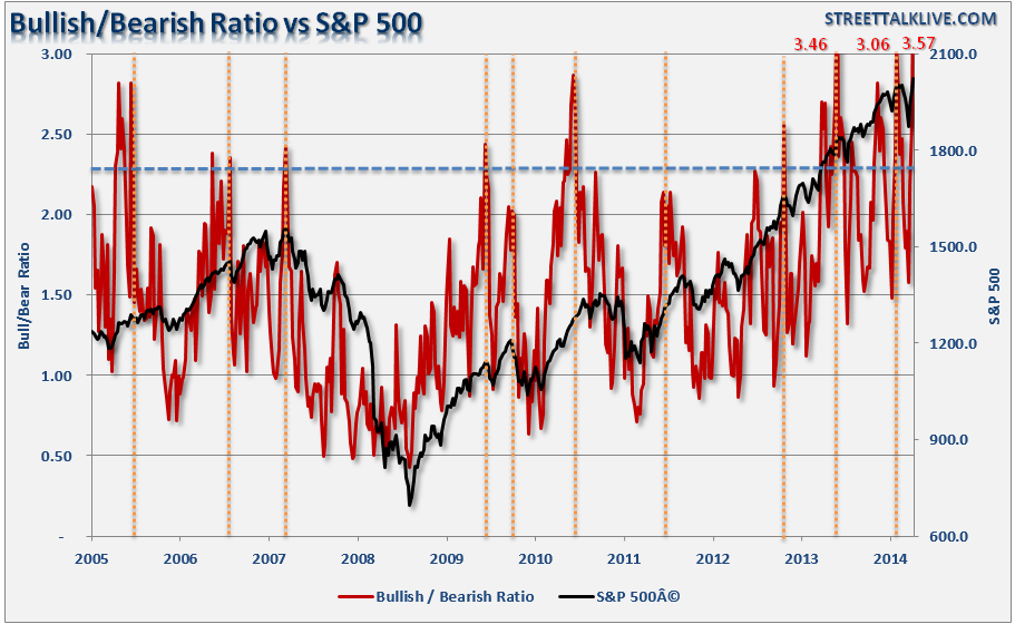
Bob Farrell's rule #9 basically states that when everyone agrees; something else is bound to happen. The next two charts show the level of "bullishness" of both individual investors (AAII Survey) and a composite index of individual and institutional money managers (AAII & INVI Surveys). Never before in history have investors been so bullish.
As I stated above -- investors are just plain "giddy" about the market.
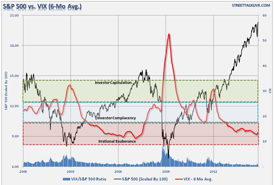
And "complacency" in the financial markets is also at levels that have had poor future outcomes.
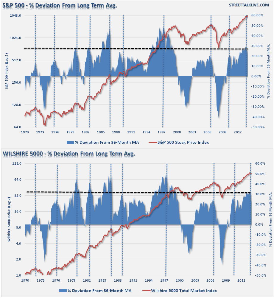
Lastly, an important chart I have shown previously, the deviation of the S&P 500 and the Wilshire 5000 from their respective 36-month moving average is at levels that have only been seen at four other periods previously.
As a money manager, I am currently long the stock market. I must be, or I potentially suffer career risk. However, my job as an advisor is not only to make money for my clients, but also to preserve their gains and investment capital as much as possible. Understanding the bullish arguments is surely important but the risk to investors is not a continued rise in asset prices, but the eventual reversion that will occur. Unfortunately, since most individuals only consider the "bull case," as it creates confirmation bias for their "greed" emotion, they never see the "train a'comin."
Hopefully, these charts will give you some food for thought. With everybody so bullish, what could possibly go wrong?

